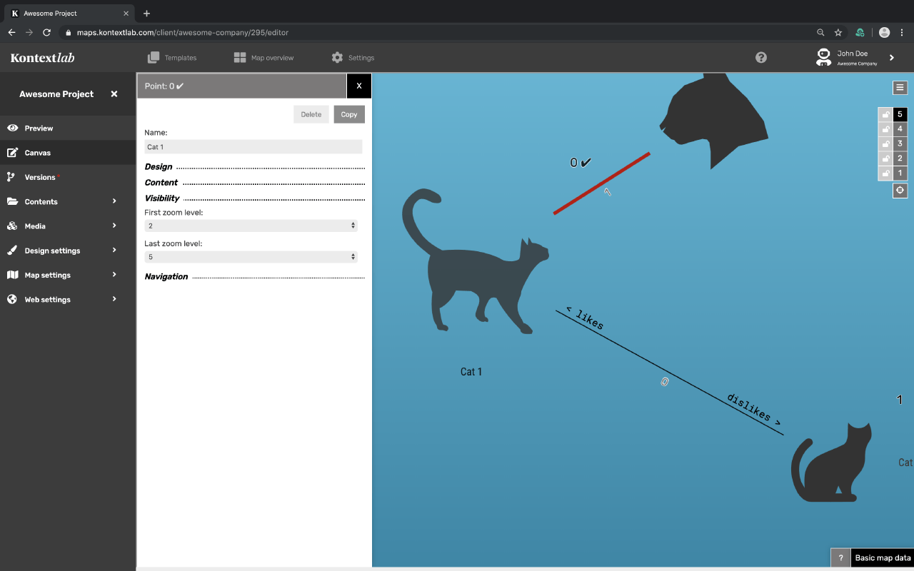
While holding down the ALT or Options key, click anywhere on the drawing area and a new dot is drawn on the map. If the dot on the drawing area is selected, the settings menu opens on the left in the Canvas Editor, with which each dot can be modified individually. The following paragraphs explain all options.
Options of Dots
How to create, set and fill dots with content
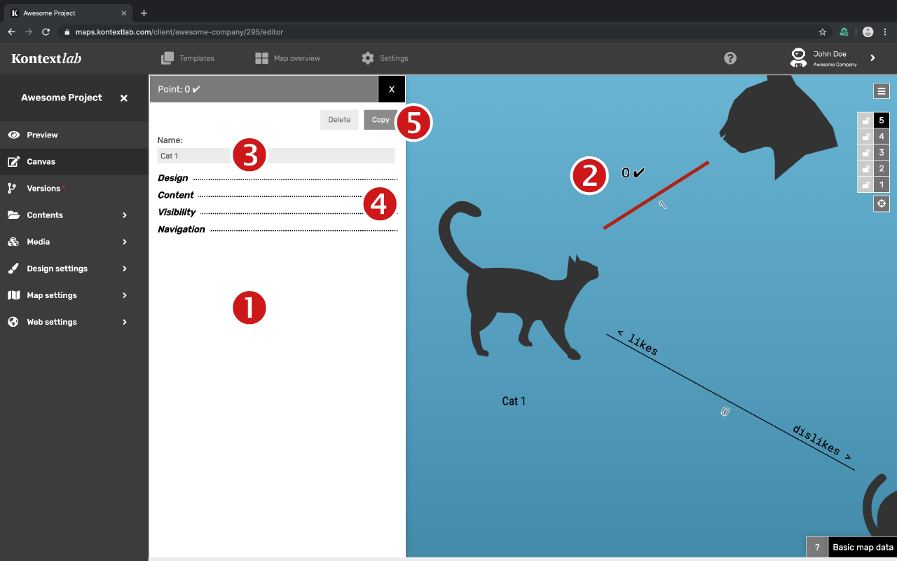
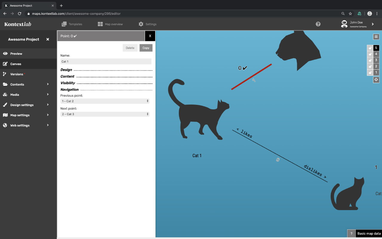
- As soon as you select a dot on the drawing area, the setting window appears on the left.
- You can tell which dot you have selected by the small tick to the right of the dot number.
- Label the dot in the field called "name"
- The four setting ranges are opened or closed by clicking on the name
- Copy your dot by selecting "copy".
Attention: The design setting AND all inserted contents will be copied.
- Appearance
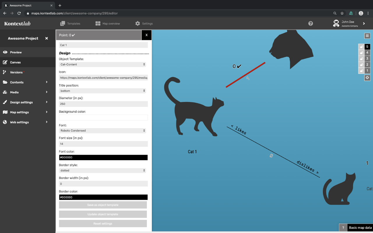
Object Template
Select one of the previously defined templates here. Global design settings are preset by default. Once object templates have been defined, they will appear here for selection. If a dot is to be designed independently of the templates, "None" is selected.
Tip: If the dot is connected to a template and you are editing the design of the dot, a hint appears that the settings differ from the template.
- If you want to keep the design independent of the template, select the template "none".
- If you want to apply the changes to the entire object template, click Update Object Template at the end of the section.
- If you want to restore the settings of the template, select “reset settings”.
- Once you have designed a dot, you can save the desired design as an object template directly from the settings options.
Symbol
To set an icon on the map, copy the image URL of the symbol (media management) and paste it here. (Format: SVG or PNG).
Exception Internet Explorer: In statistical comparison IE is a little used browser. If it is still relevant for the project, the .png format should be used instead of .svg. This is due to various IE browser bugs when processing the .svg format. Attention: Windows 7 will not receive any updates after 2020! Not even security updates! IE has not been updated since IE 2014. There are considerable security risks when using these systems.
Title Position
Specify here on which side of the dot the name should appear.
Diameter
The size of the dot in pixels is specified here. Linked symbols are automatically scaled.
Background colour
This colour fills the dot. For no background color use the transparency setting.
Font Settings
Here you can select/change the font, the size and the color individually. If changes are made here, the global settings will be overwritten.
- Border Style
- Drawn through, dashed or dotted
Width of Border
Set the width of the dot edge individually here. If no border should appear, set the width to 0px.
Colour Border
Select your colours using the Colorpicker or Hex-/RGB/RGBs values.-
- Content
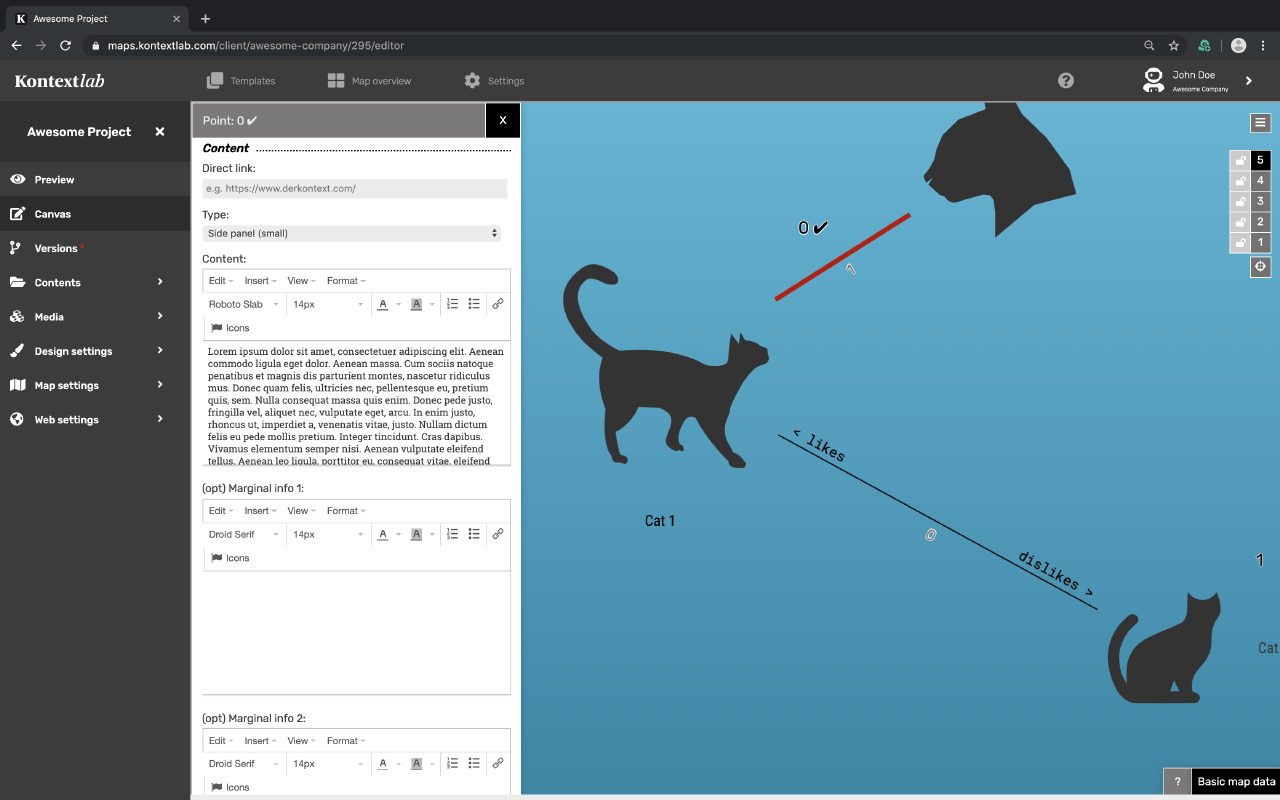
Direct Link
Enter here the URL to an external website or to a dot in your map* that you want to link to.
Hint: Direct link and pop-up content cannot be used at the same time, as this leads to a conflict between link and pop-up opening.
*Navigate to other area on the same map: Open the map preview, navigate to the desired location on the map, copy the URL and paste it here as a direct link.
Document in new Tab: If you want to directly link a document (e.g. PDF) on the map that should open in a new tab, add the following extension to the end of the URL: ?_target=blank
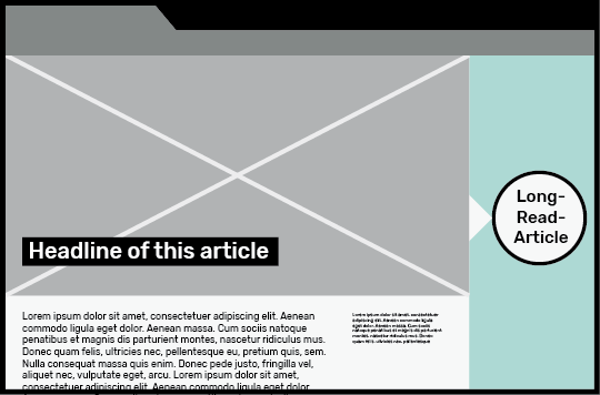
Special Case Long-Read-Article: Link the URL of the long read article (article overview) as a direct link so that it opens in a wide popup.
Type
There are three types of pop-ups in which the content is presented: Freestanding, as a side bar small and large. Except for the free-standing window, the name of the item automatically appears as a headline above the actual content and optionally below the navigation or social sharing icons.
Content
Enter the text for the dot here.
Text design: Awards, links, images etc. can be easily created using the WYSIWYG editor.
Tip: The text field can be greatly enlarged using the option: View -> Full Screen.
Format: If content is copied from a formatted document (e.g. Word), these formatting settings are adopted and overwrite the global settings. Therefore: after pasting the text, select all and click Format -> Remove formatting.
Integratable Elements:
Images, videos, graphics or audio material can be inserted in the popup:
1. Media from the media management: Copy the URL of the image from the media management (Paste -> Image)
2. External media via iFrame: media from external platforms such as Youtube provide an embed link for embedding, which is copied into the editor (Paste -> Media)
3. Media of a website: picture material, which is already hosted on the own website, can be directly integrated by means of the media URL. Enter the image address in the URL field (e.g.: https://firma.com/seite/Katze.jpg)
Separated marginal Information
Here you can enter additional texts that should stand out from the main text. In the global design settings the design can be individually designed. Both areas are automatically separated by a horizontal line.
Search Function
Enter here additional terms that are relevant for the search.
-
Visibility
-
Set here on which levels your dot should be visible. The first zoom level defines when an element is visible. The last zoom level defines up to which level the element is visible.
Pro-Tip: If you are on e.g. level 3 in the Canvas Editor during editing and draw a dot at this point, its visibility is automatically set from level 3. - Navigation
- In this area you can create a path that leads through the different dots. The name of the next or previous dot will appear at the bottom of the popup. Select the desired dots from the pulldown menu, where you will find a list of all existing dots.